Rhythm
Remote Cardiac Monitoring Platform
Oct-Dec 2020
UX Lead: Principal Designer
Most cardiac doctors and nurses use technology that’s been failing them for years. Tracking work and signing off on reports in digital platforms require hacks and workarounds to get anything done.
As the Principal Designer leading the strategy of this project, my main challenge was to provide patterns strong enough to convince people who have been in the industry for decades to change the way they work. To prove that a digital space could actually speed up their workflow rather than slow them down.
Building An All-Inclusive Report
Before the redesign of the Physician Portal, Transmission Reports covered a singular static topic: The details of patient's most recent cardiac rhythm. While that is a key aspect of a patient's cardiac health, it is not the only information needed to determine the next steps for a patient's care. Our primary goal when updating the Transmission Report was to make additional patient details readily accessible to dramatically simplify the decision-making process.
The redesigned Transmission Report experience incorporates sidebars, modals, and a wealth of other in-page interaction patterns to reveal supporting information, granting physicians access to patient and device history without ever leaving the report. In addition to overseeing the implementation of the improved interaction patterns, I purposely designed the content of the report to act as a highlight reel of information. Distinctly separated sections, coupled with the intentional use of bullet points and status indicators, set critical details at center stage.
Giving Known Patterns New Life
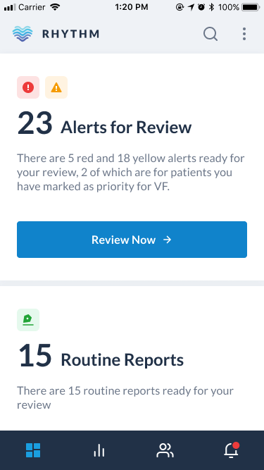
Physicians typically have a physical pile of Patient Reports to review at the end of every week. As a part of the strategic transition away from pen and paper, we wanted to make the digital review process feel as seamless as sifting through a single stack of papers.
Enter the Review Queue. While still prioritizing the details of only a single report at a time, the mechanism of the queue allowed us to automatically populate the next report as soon as the active report was reviewed and submitted.
A queue may not be a new UX concept, but the application of this pattern in this context allowed us to completely cut out the necessity of any navigation to and from other reports, saving time and cutting out the perceived effort of reviewing critical cases altogether, especially on mobile.
Integrating Accountability
While Rhythm did not want to become a project management tool, they did want users to be able to keep track of patient directives within the platform.
In addition to the aforementioned improvements to the Transmission Report, I led the strategy and design of its newly attached, lightweight, tasking system.
Purposefully built into a portable sidebar, patient care plans can now be added, viewed, and tracked from anywhere in the platform, making it impossible to lose track of patient history or next steps.

